Capturing the human form accurately in a drawing is no easy task. There is a reason why “I can’t even draw a stick person!” is so widely used—I hear it almost every time I tell someone I make art for a living. Capturing a character however, is more complex. This involves drawing or painting the human form without a direct reference, essentially creating a person who doesn’t exist.
When it comes to learning character creation, an art teacher would often introduce this skill through collage. This requires only five items: a magazine, a pair of scissors, a blank page, some Pritt glue, and an open mind. The teacher would instruct their students to cut interesting elements out of the magazine: something for a face, something to form arms, something for legs, and so forth. These seemingly mismatched elements would then be arranged and stuck down and—Voilà—a brand-new character would be born.
As an artist becomes more experienced, this character creation process becomes more refined.
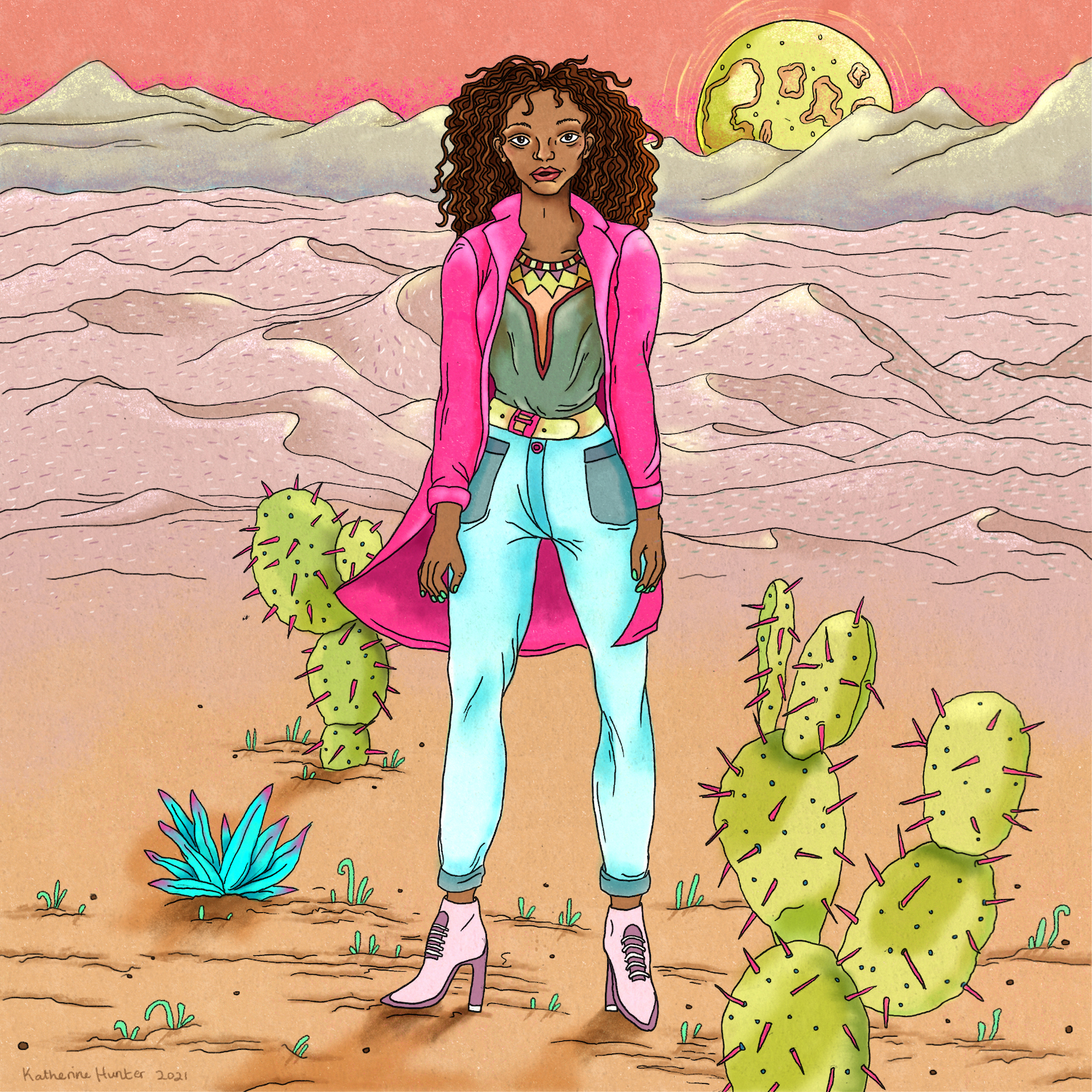
In my illustrations, the stick-and-paste process is done mentally. This means gathering references from many different places—O! I like the lady in this photo’s nose and that one has marvellous hair!—and then combining them on the page to form a new person, like an aesthetically pleasing Frankensteinian monster.
This is an important skill as an artist; it is how one goes about creating “original art” and staying out of copyright trouble. It is also one of the ways that artists can find their unique artistic voice. Many artists express their visual style in specific traits that are present in most of their characters.
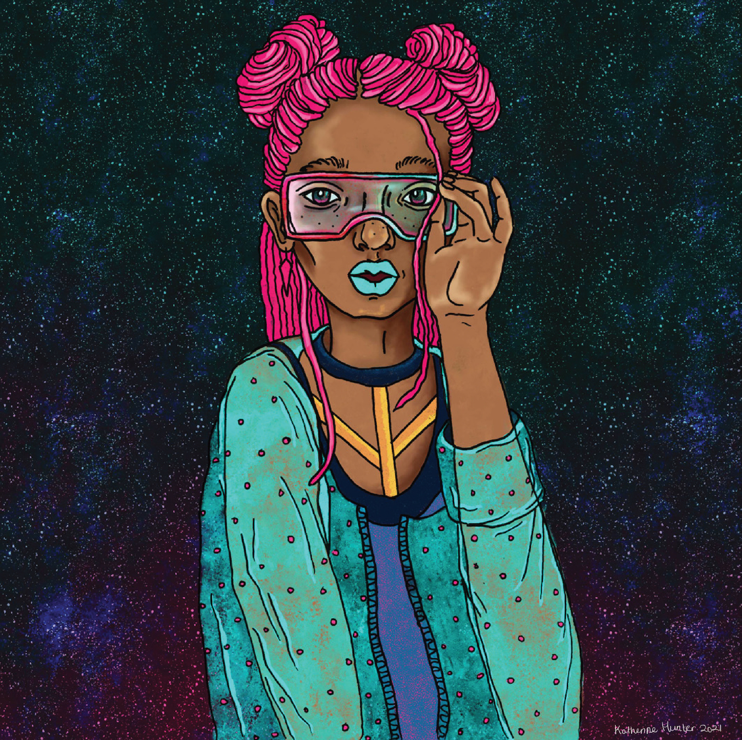
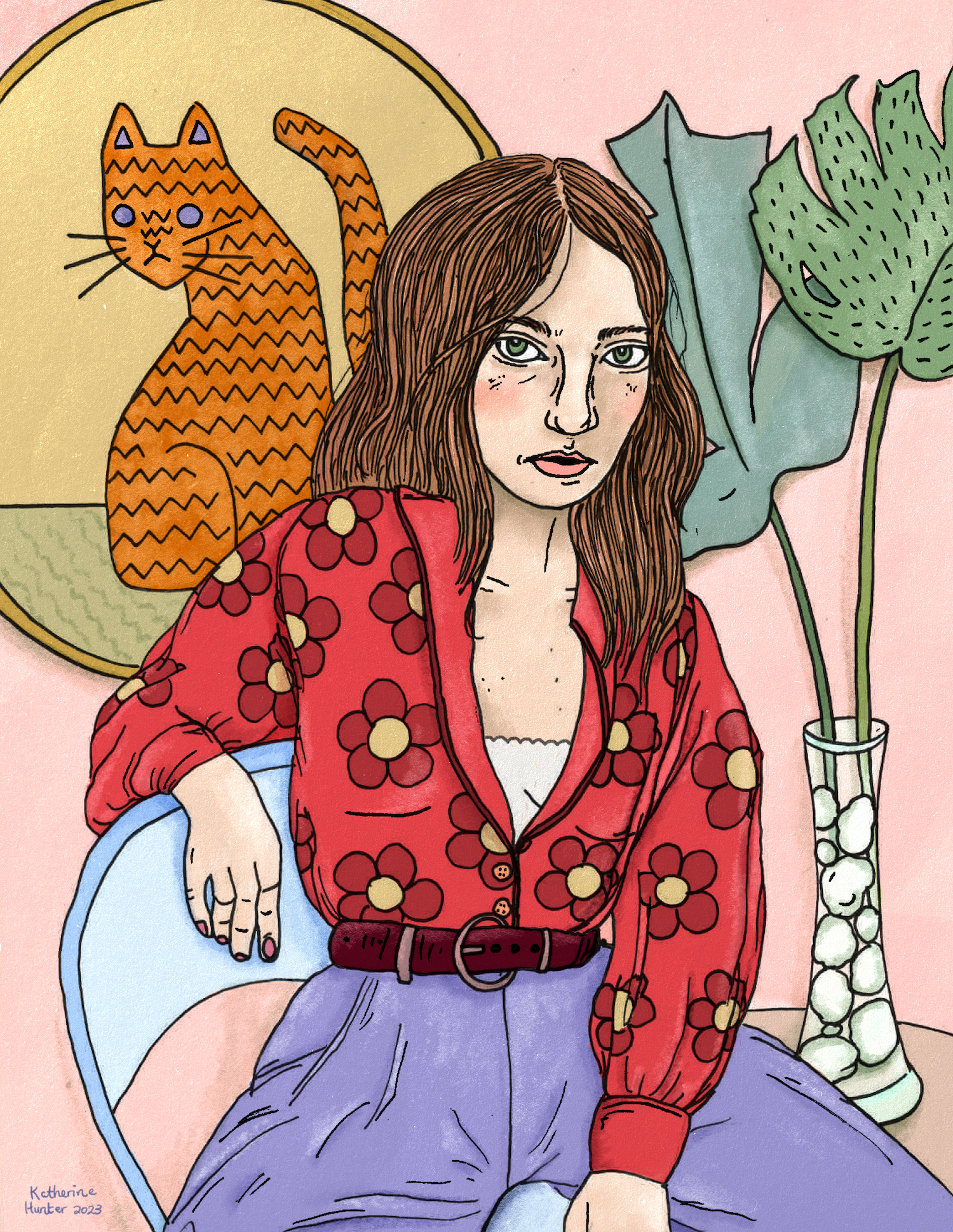
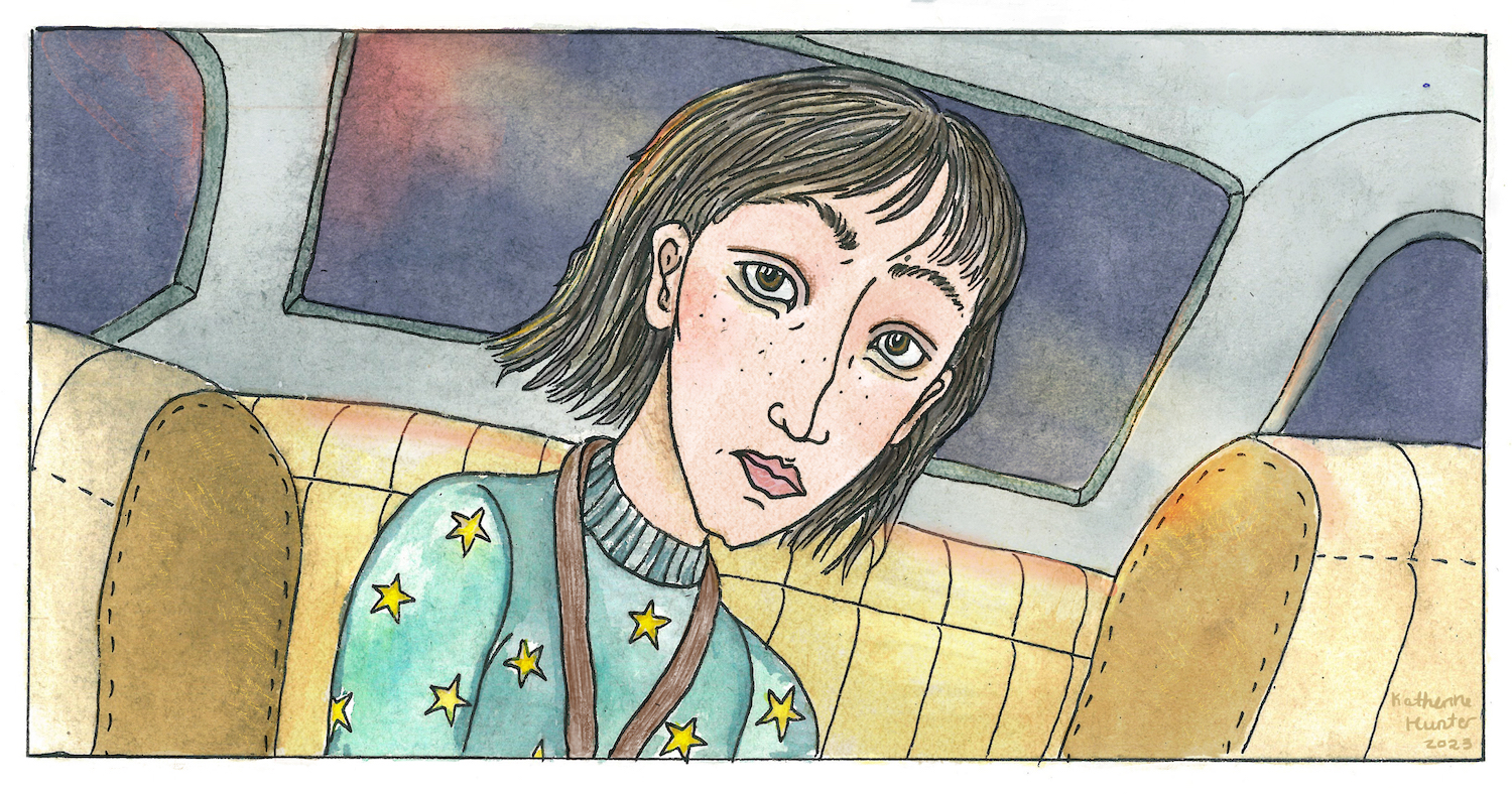
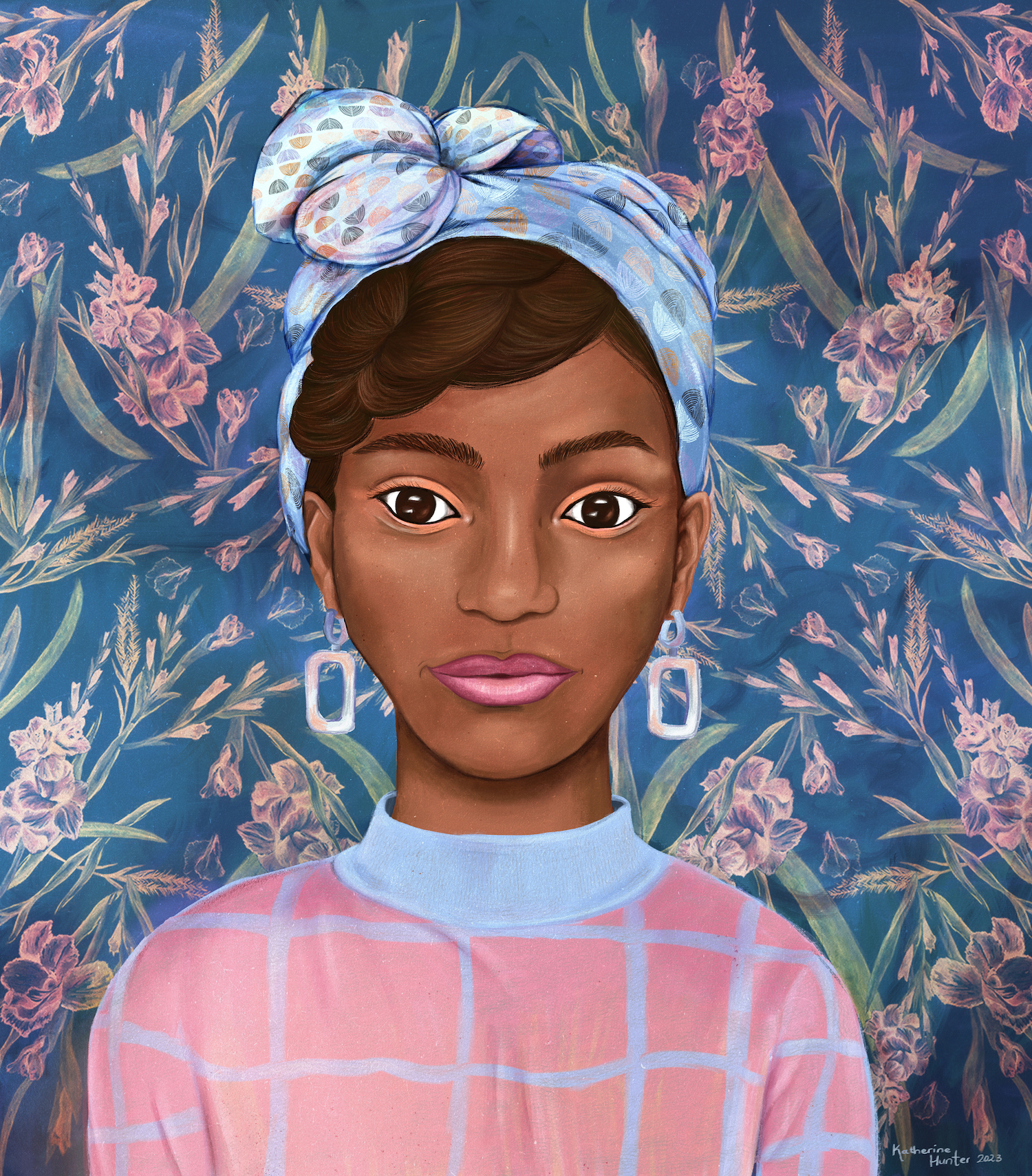
Look closely: my characters reveal my style through their noses and eyes. When it comes to characterisation, the aim is to see how exaggerating, minimising, or even leaving out different body parts can express something about the personality of the character, rather than focussing on hyper-realism.
Look: all of my characters have a line right below the eye. This is intentional. It makes my characters’ gazes feel more direct and challenging.
Katherine is a Namibian illustrator, graphic designer and writer. Katherine’s work explores how art and writing can push back against the world that we live in, especially by capturing details and creating narratives without clear answers. In 2022, Katherine’s artwork was shortlisted for the Bank Windhoek Doek Literary Awards. You can view more of her work at https://www.behance.net/katherine_hunter